
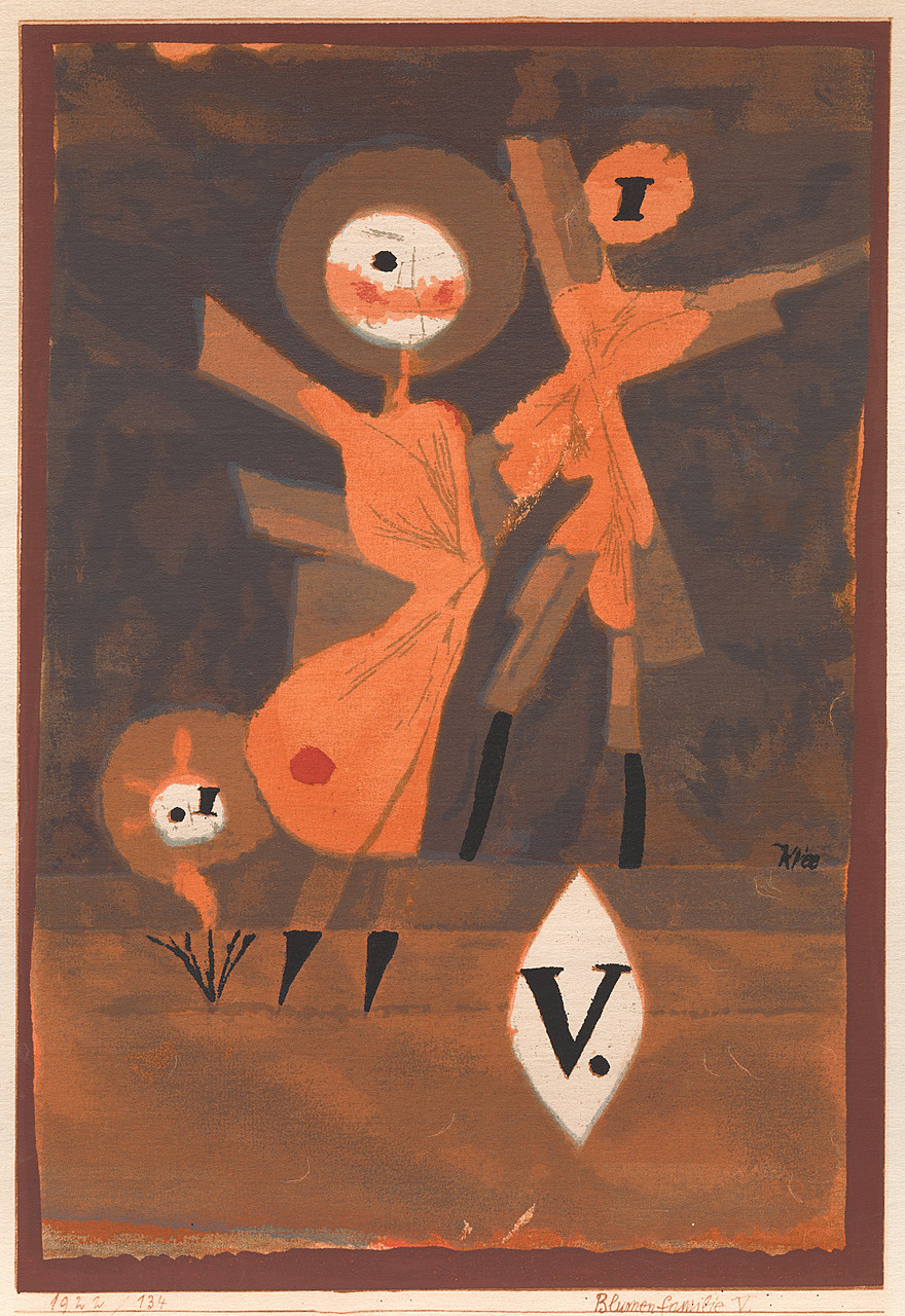
Paul Klee’s Artworks: Colour, Imagination and Experiment
Paul Klee (1879–1940) was a Swiss-German artist whose work is difficult to fit into a single category. A gifted draughtsman, colourist and teacher, he moved between abstraction and recognisable imagery, often combining the two. His paintings and drawings feature signs, symbols, figures and landscapes, rendered with a playful lightness that can sit alongside profound themes.
Klee’s art was shaped by close observation, musical thinking and a fascination with how images are made. Rather than simply depicting the world, he transformed it into a personal visual language—one that invites viewers to look, interpret and imagine.
A distinctive visual language
Many of Klee’s works appear simple at first glance: a few lines, blocks of colour or childlike shapes. Yet their compositions are carefully considered. A line might suggest a journey or a face; a patch of colour might become a town, a garden or a dreamlike landscape. Klee often used letters, arrows, grids and abstract symbols, allowing recognisable forms to emerge from patterns.
His approach was informed by a broad range of influences, including children’s drawings, folk art, music and the art he encountered on his travels. He was also associated with major modern art movements of his time, including Expressionism, Cubism and Surrealism, although his work remained highly individual.
Colour, music and movement
Colour is central to Klee’s reputation. During a trip to Tunisia in 1914, he was deeply affected by the region’s light and colour. He later recalled that colour had taken hold of him, and his work became increasingly confident in its use of luminous hues and carefully balanced tonal relationships.
Music also mattered greatly to Klee, who came from a musical family and was a skilled violinist. Some paintings seem to unfold like compositions, with repeated shapes and colours creating rhythm across the surface. His interest in music is especially clear in works such as Fugue in Red (1921), where forms seem to build and echo one another, recalling the layered structure of a fugue.
Notable Paul Klee artworks
Twittering Machine (1922)
One of Klee’s best-known works, Twittering Machine brings together delicate drawing and unsettling humour. Bird-like forms perch on a hand-cranked mechanism, their beaks open as if they are singing. The image is both whimsical and strange, inviting different readings: it may suggest nature turned into machinery, or music reduced to a mechanical performance. The work is held by the Museum of Modern Art in New York.
Senecio (1922)
In Senecio, a face is constructed from simple geometric shapes. Coloured squares define the head, while the eyes and mouth give it an expression that is at once comic and enigmatic. The title refers to a flowering plant, but the image also plays with the idea of a face as a mask or arrangement of signs. Its apparent simplicity makes it one of Klee’s most memorable explorations of portraiture.
Fish Magic (1925)
Fish Magic combines a dark, layered background with fish, plants, stars and other symbols. A small square of bright light appears to open a window into the scene. The painting feels like a private underwater world, but its elements resist a single explanation. Klee’s mixture of fantasy and carefully controlled composition gives the work its distinctive sense of mystery.
Ad Parnassum (1932)
Often regarded as one of Klee’s major late works, Ad Parnassum is built from a mosaic of tiny coloured marks. A triangular mountain rises towards a sun-like circle, while a doorway at its base suggests an entrance into the landscape. The title evokes Mount Parnassus, associated with the Muses in Greek mythology. The painting’s painstaking patterning turns colour into both image and structure.
Angelus Novus (1920)
This small drawing of an angel has become famous partly through its later interpretation by the philosopher and critic Walter Benjamin. The figure’s wide eyes, outstretched wings and awkward stance make it appear simultaneously angelic and unsettling. Benjamin saw it as the “angel of history”, but the artwork also stands on its own as an example of Klee’s ability to create an expressive figure with a few economical lines.
Teaching and artistic ideas
From 1921 to 1931, Klee taught at the Bauhaus, the influential German school of art, design and architecture. His teaching explored the basic elements of visual form, including line, colour, movement and composition. He gathered many of these ideas in the Pedagogical Sketchbook, published in 1925. The book reflects his belief that drawing could reveal how forms grow and change, rather than merely reproduce what the eye sees.
Klee’s ideas about art were also expressed in his writing and lectures. He famously suggested that art does not simply reproduce the visible world; it can make visible what might otherwise remain unseen. This principle is evident throughout his work, where inner states, rhythms and imagined places take visual form.
Later works and legacy
Klee’s final years were marked by serious illness and political upheaval. After the Nazis came to power, his work was denounced as “degenerate”, and he left Germany for Switzerland. Despite declining health, he continued to work, producing a large number of drawings and paintings. His later style often features bold, simplified figures and dark, direct lines.
Today, Klee is recognised as one of the most original artists of modern European art. His artworks reward both close study and open-ended interpretation: a simple shape can become a character, a landscape or a musical note, depending on how it is seen. That balance of clarity and mystery is a lasting part of his appeal.
Six Reasons to Admire Paul Klee’s Artworks
- Distinctive use of colour and shape
- Playful, imaginative compositions
- A unique blend of abstraction and imagery
- Rich musical rhythms and patterns
- Small details invite close looking
- Influential works with lasting appeal
Seven Potential Drawbacks of Paul Klee’s Artworks
- Some works can feel overly abstract.
- Symbolism may be difficult to interpret.
- The childlike style may seem simplistic.
- Muted palettes appear in some pieces.
- Repetition can make works feel similar.
- Small details are easy to miss.
- The imagery may feel cryptic.
Distinctive use of colour and shape
Paul Klee’s artworks are instantly recognisable for their distinctive use of colour and shape. He combined vivid hues with simple geometric forms, lines and symbols to create images that feel both playful and carefully balanced. Rather than using colour solely to imitate the natural world, Klee used it to suggest mood, movement and meaning, while his simplified shapes invite viewers to discover faces, landscapes and patterns within the composition. This inventive approach gives his work a distinctive visual charm and encourages fresh interpretations with every viewing.
Playful, imaginative compositions
Paul Klee’s artworks are celebrated for their playful, imaginative compositions, in which simple lines, shapes and colours open the door to unexpected worlds. A bird may become part of a curious machine, while a few geometric forms can suggest a face, a town or a dreamlike landscape. This sense of visual play makes his work feel inviting and spontaneous, yet each element is carefully arranged. Klee encourages viewers to look beyond the obvious and discover their own stories within his art.
A unique blend of abstraction and imagery
Paul Klee’s artworks are distinctive for their unique blend of abstraction and recognisable imagery. Geometric shapes, expressive lines and carefully chosen colours often suggest familiar things—such as faces, figures, plants or landscapes—without depicting them realistically. This balance gives his work a sense of playful mystery: viewers can recognise elements of the scene while still having room to interpret them in their own way.
Rich musical rhythms and patterns
Paul Klee’s artworks often have a strong sense of musical rhythm. Repeated lines, shapes and colours move across the canvas like notes in a composition, creating patterns that guide the eye and give each work a lively flow. His deep interest in music helped him balance repetition and variation, so that even abstract paintings can feel as though they have their own beat or melody.
Small details invite close looking
Paul Klee’s artworks reward close attention: small marks, symbols and shifts in colour often reveal details that are easy to miss at first glance. A line may suggest a figure, while a tiny shape can change the meaning or mood of the whole composition. This encourages viewers to slow down, look again and discover something new with each viewing.
Influential works with lasting appeal
Paul Klee’s artworks have lasting appeal because they combine inventive ideas with a distinctive visual language that continues to inspire artists and audiences. Works such as Twittering Machine and Senecio are instantly recognisable, yet their playful forms, expressive colours and open-ended symbolism invite fresh interpretations. Klee’s influence can be seen in the way later artists have explored abstraction, illustration and the expressive potential of simple shapes and lines.
Some works can feel overly abstract.
Some of Paul Klee’s artworks can feel overly abstract, particularly to viewers who prefer clear subjects or realistic detail. His use of symbols, simplified shapes and unusual colour combinations can make a painting’s meaning difficult to pin down, and not every work offers an obvious point of entry. This ambiguity is part of Klee’s distinctive style, but it may leave some viewers feeling uncertain about what they are looking at or how to respond.
Symbolism may be difficult to interpret.
One possible drawback of Paul Klee’s artworks is that their symbolism can be difficult to interpret. He often used personal signs, abstract shapes and dreamlike imagery without providing a clear explanation, so viewers may be unsure what a particular work represents. This ambiguity can make some paintings feel puzzling or inaccessible, especially to those who prefer art with a more direct subject or message.
The childlike style may seem simplistic.
One possible drawback of Paul Klee’s artworks is their childlike style, which can seem simplistic at first glance. The playful figures, basic shapes and apparent spontaneity may lead some viewers to overlook the thought and technical skill behind them, or to feel that the work lacks complexity. However, Klee often used this visual simplicity deliberately, combining it with careful composition, subtle symbolism and deeper ideas.
Muted palettes appear in some pieces.
Some of Paul Klee’s artworks use muted palettes that may feel subdued beside his more vivid, colour-rich pieces. Their restrained tones can make certain compositions seem less immediately striking, particularly for viewers drawn to bold colour. However, this subtlety can also encourage closer attention to the work’s delicate lines, textures and underlying mood.
Repetition can make works feel similar.
Although Paul Klee’s use of recurring symbols, geometric shapes and delicate lines gives his art a distinctive visual identity, repetition can make some works feel similar. Viewers may find that familiar motifs and compositional patterns recur so often that individual pieces seem less distinct, particularly when several are viewed together. This consistency is also part of Klee’s artistic language, but it may leave those seeking greater variety feeling that some artworks lack a clearly separate character.
Small details are easy to miss.
Some of Paul Klee’s artworks are rich in tiny symbols, fine lines and subtle changes of colour, so their smaller details can be easy to overlook at first. This may make the works less immediately accessible, particularly when viewed from a distance or in a busy gallery. Taking time to look closely—or seeing a reproduction at a larger scale—can reveal details that add depth to the composition.
The imagery may feel cryptic.
One possible drawback of Paul Klee’s artworks is that their imagery can feel cryptic. His use of symbols, abstract shapes and dreamlike scenes often leaves their meaning open to interpretation, so viewers looking for a clear subject or story may find the work puzzling or difficult to connect with.