
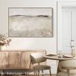
Neutral Wall Art: A Calm and Versatile Choice for Your Home
Neutral wall art can bring warmth, balance and character to a room without overwhelming its existing colours or furnishings. From soft landscapes and abstract forms to monochrome photography, it offers an adaptable way to make a space feel considered and inviting.
Neutral does not have to mean plain. Cream, beige, taupe, warm grey, charcoal and earthy shades all have their own character. The key is choosing artwork with tones, textures and details that complement the room while still giving the eye something to enjoy.
What counts as neutral wall art?
Neutral wall art is artwork built around a restrained or earthy palette. It may feature gentle contrasts, muted colours or natural subjects, such as landscapes, plants and organic shapes. Some pieces are almost entirely monochrome; others include subtle touches of colour that add depth without dominating the space.
Texture and composition matter just as much as colour. A minimal line drawing can feel crisp and modern, while a textured abstract or soft-toned landscape can make a room feel more relaxed. Choosing a piece with visible brushwork, layered tones or an interesting surface can help a quieter palette feel full of life.
Why choose neutral artwork?
- It is easy to style: Neutral shades work with a wide range of furniture, materials and decorating styles.
- It creates a calmer feel: Softer colours can help a room feel restful, making them a popular choice for bedrooms and living spaces.
- It gives a room cohesion: Artwork can bring together colours found in cushions, rugs, curtains and furniture.
- It can grow with your décor: A versatile piece may continue to suit the room even when you change other furnishings.
Choosing the right piece for your space
Start by considering the room’s existing colours. In a bright, cool-toned interior, artwork with soft grey, white or charcoal may feel at home. If the space features timber, woven materials or warmer paint shades, look for art with sand, ochre, cream or brown tones. The aim is not necessarily to match everything exactly, but to create a pleasing relationship between the artwork and its surroundings.
Think about contrast, too. A pale artwork can blend gently into a light wall, while a darker frame or stronger charcoal detail can give it definition. In a room with darker walls, lighter artwork may stand out and lift the space.
Consider size and placement
The scale of a piece can change how a room feels. A large work can act as a focal point above a sofa, bed or sideboard. A smaller print may suit a narrow wall or form part of a carefully arranged gallery wall. As a general guide, artwork above furniture tends to look balanced when it is around two-thirds of the furniture’s width, though the best choice depends on the room and the look you want to achieve.
Hang artwork at a comfortable viewing height, taking account of the furniture beneath it. If you are planning a gallery wall, lay the arrangement out on the floor first or use paper templates on the wall. A consistent frame style can make a varied collection feel unified, while a mix of frame finishes can create a more informal look.
Ways to style neutral wall art
Neutral artwork works well with natural materials such as timber, linen, wool, stone and rattan. These textures add warmth and help a restrained palette feel layered rather than flat. You can also repeat a colour from the artwork elsewhere in the room, perhaps in a cushion, vase or throw, to tie the scheme together.
For a simple, contemporary look, choose one statement piece and give it space to breathe. For a more collected feel, group several works with related tones but different shapes or subjects. Pairing abstract art with photography or botanical prints can add variety while keeping the overall palette calm.
Make neutral art personal
The most successful wall art is not simply chosen to match the furniture. It should also reflect what you enjoy looking at. A favourite landscape, a subtle abstract or a striking black-and-white image can bring a personal note to a room, even when its colours are understated.
With the right subject, scale and placement, neutral wall art can make a home feel more balanced and complete. Whether you prefer a single statement piece or a collection of smaller works, its quiet versatility offers plenty of room to create a style that feels like your own.
Neutral Wall Art: 8 Frequently Asked Questions
- What is neutral wall art?
- How do I choose neutral wall art for my room?
- What colours are considered neutral in wall art?
- Does neutral wall art suit every interior style?
- What size neutral wall art should I choose?
- Where should I hang neutral wall art?
- How can I style neutral wall art without making a room feel bland?
- What frames work best with neutral wall art?
What is neutral wall art?
Neutral wall art is artwork that uses a soft, understated palette, such as cream, beige, taupe, grey, black and earthy tones. It can include abstract designs, landscapes, photography or botanical subjects, with texture and composition adding interest without relying on bright colours. Its versatile shades make it easy to pair with different interior styles and create a calm, balanced feel in a room.
How do I choose neutral wall art for my room?
To choose neutral wall art for your room, consider the colours, mood and style already in the space. Soft creams, beiges and warm greys complement natural materials and cosy interiors, while charcoal or black details can add contrast to a lighter scheme. Think about the artwork’s size and where it will hang: a larger piece can create a focal point above a sofa or bed, while smaller works suit shelves or a gallery wall. Look for a subject, texture or composition you genuinely enjoy, and choose a frame that works with your furnishings without needing to match them exactly.
What colours are considered neutral in wall art?
Neutral colours in wall art usually include white, cream, beige, taupe, brown, grey and black, along with soft, earthy shades such as sand, stone and muted green. These tones can be warm or cool, so consider the colours already in your room when choosing a piece. Neutral art needn’t be entirely monochrome: subtle accents of colour can add depth while keeping the overall effect calm and versatile.
Does neutral wall art suit every interior style?
Neutral wall art suits most interior styles because its understated colours are easy to pair with different furnishings and finishes. It can complement minimalist, Scandinavian and contemporary rooms, while warmer tones and textured pieces work beautifully in rustic, traditional or bohemian spaces. The key is to choose artwork whose palette, subject and frame feel in keeping with the room. Neutral does not have to mean bland: texture, contrast and expressive shapes can add character without overpowering your décor.
What size neutral wall art should I choose?
Choose neutral wall art that feels in proportion to the wall and the furniture beneath it. Above a sofa or bed, a single piece around two-thirds of the furniture’s width often creates a balanced look; for a smaller wall, choose a modest print or arrange several pieces as a gallery wall. Consider the viewing distance, too: larger rooms can carry bigger artwork, while compact spaces may suit smaller pieces. If you’re unsure, mark out the artwork’s dimensions on the wall with paper before you buy.
Where should I hang neutral wall art?
Hang neutral wall art where it can bring balance and interest to the room, such as above a sofa, bed, fireplace or sideboard. As a guide, position the centre of the artwork at eye level, adjusting for furniture and the room’s layout. Choose a size that feels in proportion to the wall and surrounding furnishings; a larger piece can make a calm focal point, while smaller works can be grouped together. Consider the light, too, and avoid placing artwork where direct sunlight may cause it to fade.
How can I style neutral wall art without making a room feel bland?
To style neutral wall art without making a room feel bland, build interest through contrast, texture and thoughtful placement. Pair soft-toned artwork with tactile materials such as linen, timber or ceramics, and add a few deeper accents in cushions, rugs or frames. Choose pieces with expressive brushwork, layered tones or distinctive shapes, and vary the scale if you are creating a gallery wall. The result can feel calm and cohesive while still having warmth and personality.
What frames work best with neutral wall art?
The best frame depends on the artwork and the feel of your room. Natural wood frames add warmth and pair beautifully with earthy tones, while black frames create crisp definition around minimalist or monochrome pieces. White or pale frames offer a light, understated finish, and metallic frames can bring a subtle touch of elegance. For a cohesive look, choose a frame that picks up a colour or material already found in the space, while making sure it complements rather than competes with the artwork.