
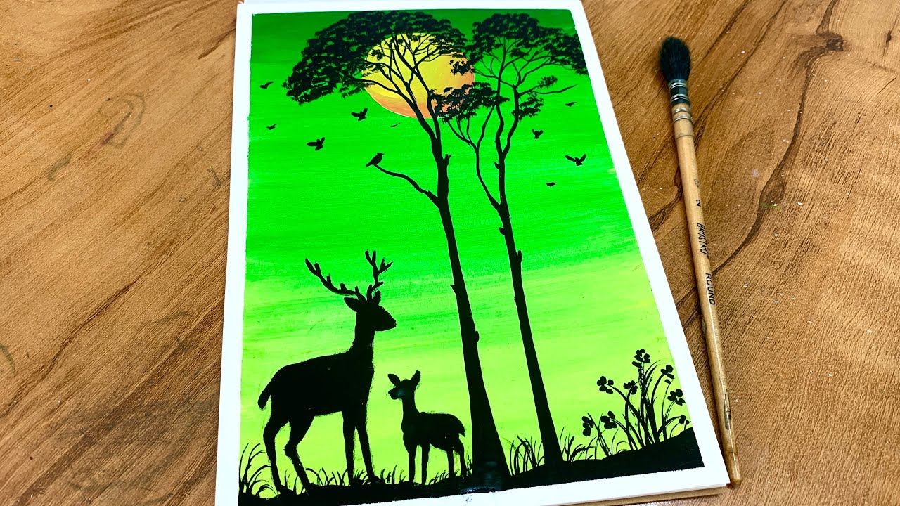
Poster Colour Painting: A Guide to a Versatile Art Medium
Poster colour painting is a lively, accessible way to explore colour, shape and composition. Popular with beginners, students and professional artists alike, poster colours are water-based paints known for their bold hues and matt, opaque finish. They can be used to create everything from simple illustrations to detailed paintings, making them a flexible choice for a wide range of projects.
What is poster colour?
Poster colour is an opaque water-based paint, usually supplied in tubes or jars. It is diluted and cleaned up with water, but unlike watercolour, it is designed to cover the surface beneath it. This makes it possible to paint light colours over dark ones and to build up areas of flat, even colour.
Poster colours are often compared with gouache, another opaque water-based paint. The two share some qualities, although their ingredients and consistency can vary between brands. Poster colours are commonly used for bold, graphic work, while artists may choose gouache when they want a more refined finish or a greater range of subtle effects.
Materials to get started
You do not need an elaborate collection of equipment to begin. A small selection of poster colours, a few brushes and suitable paper are enough to try the medium.
- Poster colours: Start with a basic set and mix additional shades as needed.
- Paper or board: Choose a sturdy surface that can handle water. Heavyweight cartridge paper or painting paper is a good option.
- Brushes: Flat brushes are useful for covering larger areas, while round brushes are well suited to details and outlines.
- Palette: Use a palette or a clean, non-absorbent surface to mix colours.
- Water and cloth: Keep a jar of clean water nearby for diluting paint and rinsing brushes, along with a cloth for drying them.
- Pencil and eraser: A light preliminary drawing can help plan the composition.
Getting the consistency right
The amount of water you add affects how poster colour behaves. Used straight from the container or with only a little water, it gives strong, opaque coverage. Add more water for a thinner, easier-flowing layer, but bear in mind that excessive dilution can make the paint less opaque and may cause the paper to buckle.
Try mixing a small amount of paint with water on your palette before applying it to the final surface. Aim for a consistency that spreads smoothly without running. If the paint feels too thick, add water a little at a time; if it is too thin, mix in more paint.
Basic techniques
Flat washes
For a flat wash, mix enough paint to cover the area you need, then apply it in steady, even strokes with a flat brush. Keeping the brush well loaded can help prevent streaks. Let the layer dry before adding another.
Layering
One of the medium’s most useful qualities is its ability to cover previous layers. Once a section is dry, you can paint another colour over it to adjust shapes, add highlights or correct small areas. Work gently, as repeatedly brushing a damp layer can lift or disturb the paint underneath.
Colour mixing
Mixing colours on a palette is a good way to create a wider range of shades from a limited set. Begin with small quantities: poster colour can be strong, and it is easier to deepen a mixture gradually than to lighten one that has become too dark. Keep a note of successful mixes if you would like to reproduce them.
Dry-brush marks
For broken, textured strokes, load a dry brush with a small amount of paint and lightly drag it across the paper. This technique can suggest rough surfaces, grasses, fabric or expressive highlights.
A simple painting process
- Plan the image. Sketch the main shapes lightly in pencil, keeping the drawing simple.
- Choose a limited palette. Select a few colours that work well together rather than using every colour at once.
- Paint the largest areas first. Apply broad areas of colour and allow them to dry.
- Add smaller shapes and details. Use a smaller brush for edges, patterns and accents.
- Review the balance. Add or adjust colour where needed, then leave the painting to dry fully.
Tips for a better result
- Test colours on a scrap of the same paper before using them in the painting.
- Use a separate brush for very light colours if you want to keep them clean.
- Rinse brushes between colours and avoid leaving them standing in water.
- Apply paint in layers rather than scrubbing repeatedly at one area.
- Work on a flat surface and secure the paper if it begins to curl.
- Check the finished work in good light, as wet paint can look different from dry paint.
How to care for a finished painting
Poster colour paintings can be sensitive to moisture and rubbing, so handle them carefully once dry. Store them flat or in a protective sleeve, and keep them away from damp conditions and direct sunlight. If the work is important or intended for display, consider asking a professional framer about suitable protection. Test any fixative on a separate sample first, as it may alter the colour or finish.
A medium for experimentation
Poster colour is valued for its vivid colour, straightforward materials and forgiving, opaque layers. It suits bold graphic designs, illustrations, studies and playful experiments. By trying different brushstrokes, paint consistencies and colour combinations, artists can discover just how expressive this approachable medium can be.
Top Tips for Mastering Poster Colour Painting Techniques
- Use thick paper to prevent buckling.
- Mix colours on a clean palette.
- Add water sparingly for bold colour.
- Paint large areas before small details.
- Let each layer dry before adding another.
- Wash brushes between colours.
Use thick paper to prevent buckling.
Use thick paper when painting with poster colours to help prevent the surface from buckling as it absorbs water. A heavyweight cartridge paper or watercolour paper provides a sturdier base, helping the paint go on more smoothly and keeping your finished work flatter as it dries.
Mix colours on a clean palette.
Mix colours on a clean palette to keep your shades bright and true. Leftover paint can muddy a fresh mix, so wipe the palette between colours and add small amounts of paint at a time. Test the mixture on a scrap of paper before using it in your painting, and note the proportions if you want to recreate the shade.
Add water sparingly for bold colour.
Add water sparingly when using poster colour to keep its pigments rich and vibrant. Too much water can make the paint thin and translucent, reducing its bold, opaque finish. Start with a small amount, mix well, and add a little more only if the paint is difficult to spread.
Paint large areas before small details.
Paint the largest areas of your picture first, then add the smaller details once the base layers are dry. This makes it easier to establish the overall composition and colour balance, while helping fine lines and accents stay crisp rather than being lost beneath later brushstrokes. Use a broader brush for larger shapes and switch to a smaller one as you work towards the details.
Let each layer dry before adding another.
Let each layer of poster colour dry fully before adding another. Painting over a damp layer can cause the colours to mix, become patchy or lift from the paper. Waiting helps preserve clean edges and lets you build up opaque colour with greater control.
Wash brushes between colours.
Wash your brushes between colours to keep your paints clean and true to shade. Rinse the bristles thoroughly in clean water, gently wipe away any excess, then pick up the next colour. This is especially important when moving from a dark or strong colour to a pale one, as even a small amount of leftover paint can muddy the new shade.